Statistical Analysis in R
Last updated on 2026-05-05 | Edit this page
Estimated time: 90 minutes
Overview
Questions
- How do I run t-tests, correlations, and regression in R?
- How does R output compare to SPSS output tables?
- How do I extract and report results?
Objectives
- Run independent and paired samples t-tests
- Calculate correlations
- Fit and interpret a simple linear regression
- Map R output back to familiar SPSS output tables
- Extract results as a tidy data frame using
broom

From SPSS dialogs to R functions
In SPSS, every statistical test lives behind a menu: Analyze > Compare Means, Analyze > Correlate, and so on. In R, each test is a single function call. The table below maps the SPSS dialogs you already know to their R equivalents:
| Analysis | SPSS menu path | R function |
|---|---|---|
| Independent-samples t-test | Analyze > Compare Means > Independent-Samples T Test | t.test(y ~ group, data = df) |
| Paired-samples t-test | Analyze > Compare Means > Paired-Samples T Test | t.test(x, y, paired = TRUE) |
| Bivariate correlation | Analyze > Correlate > Bivariate | cor.test(df$x, df$y) |
| Linear regression | Analyze > Regression > Linear |
lm(y ~ x1 + x2, data = df) +
summary()
|
Let’s load our data and packages:
R
library(tidyverse)
library(broom)

visitors <- read_csv("data/aruba_visitors.csv")
A quick word on normality
Parametric tests like the t-test assume roughly normal data, but they are surprisingly robust to violations of that assumption. A fast visual check with a histogram or a Q-Q plot is usually enough:
R
ggplot(visitors, aes(x = avg_spending_usd)) +
  geom_histogram(bins = 20) +
  theme_minimal()

ggplot(visitors, aes(sample = avg_spending_usd)) +
  stat_qq() + stat_qq_line() +
  theme_minimal()
As a rule of thumb: with n > 30 per group, the
Central Limit Theorem does most of the work for you. With small samples
and visibly non-normal data, reach for a non-parametric alternative
(wilcox.test() instead of t.test()). The
formal Shapiro-Wilk test (shapiro.test()) is available when
you need it, but on large samples it flags trivial deviations, so always
look at the plot first.
T-tests
Independent-samples t-test
In SPSS, you would go to Analyze > Compare Means > Independent-Samples T Test, move your test variable to the “Test Variable(s)” box, move your grouping variable to the “Grouping Variable” box, and define the two groups.
In R, it is one line. Let’s test whether the average spending differs between US and Netherlands visitors:
R
# Filter to just the two groups we want to compare
us_nl <- visitors |>
  filter(origin %in% c("United States", "Netherlands"))

# Run the independent-samples t-test
t_result <- t.test(avg_spending_usd ~ origin, data = us_nl)
t_result
OUTPUT
	Welch Two Sample t-test

data:  avg_spending_usd by origin
t = -16.195, df = 37.99, p-value < 2.2e-16
alternative hypothesis: true difference in means between group Netherlands and group United States is not equal to 0
95 percent confidence interval:
 -280.1256 -217.8744
sample estimates:
  mean in group Netherlands mean in group United States
978.5 1227.5 Reading the t-test output — SPSS comparison
The R output gives you the same information as the SPSS “Independent Samples Test” table, just arranged differently:
| SPSS output column | R output line |
|---|---|
| t | t = ... |
| df | df = ... |
| Sig. (2-tailed) | p-value = ... |
| Mean Difference | difference in means shown in estimates |
| 95% CI of the Difference | 95 percent confidence interval: |
The key difference: SPSS shows Levene’s test for equality of
variances automatically. R’s t.test() uses the Welch
correction by default (which does not assume equal
variances). This is actually the better default — many statisticians
recommend always using the Welch t-test.
If you need the equal-variances version (the “Equal variances
assumed” row in SPSS), add var.equal = TRUE:
R
t.test(avg_spending_usd ~ origin, data = us_nl, var.equal = TRUE)
Paired-samples t-test
A paired t-test compares two measurements on the same cases. Let’s compare Q1 vs. Q3 hotel occupancy rates (the same hotels measured in different quarters):
R
# Get Q1 and Q3 data for each year
q1_data <- visitors |>
  filter(quarter == "Q1") |>
  arrange(year, origin) |>
  pull(hotel_occupancy_pct)

q3_data <- visitors |>
  filter(quarter == "Q3") |>
  arrange(year, origin) |>
  pull(hotel_occupancy_pct)

# Paired t-test
t.test(q1_data, q3_data, paired = TRUE)
OUTPUT
	Paired t-test

data:  q1_data and q3_data
t = 3.6602, df = 29, p-value = 0.000998
alternative hypothesis: true mean difference is not equal to 0
95 percent confidence interval:
  4.941648 17.458352
sample estimates:
mean difference
           11.2
In SPSS this would be Analyze > Compare Means > Paired-Samples T Test, where you select the two variables as a pair.
Correlation
In SPSS: Analyze > Correlate > Bivariate. Move variables to the “Variables” box and select Pearson, Spearman, or both.
Let’s test the correlation between average spending and satisfaction:
R
cor.test(visitors$avg_spending_usd, visitors$satisfaction_score)
OUTPUT
	Pearson's product-moment correlation

data:  visitors$avg_spending_usd and visitors$satisfaction_score
t = 18.69, df = 118, p-value < 2.2e-16
alternative hypothesis: true correlation is not equal to 0
95 percent confidence interval:
 0.8110127 0.9037614
sample estimates:
      cor
0.8645736 Reading correlation output — SPSS comparison
| SPSS output | R output |
|---|---|
| Pearson Correlation |
cor (the estimate at the end) |
| Sig. (2-tailed) | p-value |
| N | shown in the data, not in output |
| 95% CI | 95 percent confidence interval |
One advantage of R: cor.test() gives you a confidence
interval for the correlation by default. SPSS does not show this unless
you use syntax.
For a correlation matrix of multiple variables (like the SPSS
correlation table), use cor():
R
visitors |>
  select(visitors_stayover, avg_stay_nights, avg_spending_usd,
         hotel_occupancy_pct, satisfaction_score) |>
  cor(use = "complete.obs") |>
  round(3)
OUTPUT
                    visitors_stayover avg_stay_nights avg_spending_usd
visitors_stayover               1.000           0.276            0.622
avg_stay_nights                 0.276           1.000            0.597
avg_spending_usd                0.622           0.597            1.000
hotel_occupancy_pct             0.231           0.166            0.206
satisfaction_score              0.589           0.674            0.865
                    hotel_occupancy_pct satisfaction_score
visitors_stayover                 0.231              0.589
avg_stay_nights                   0.166              0.674
avg_spending_usd                  0.206              0.865
hotel_occupancy_pct               1.000              0.575
satisfaction_score                0.575              1.000
Linear regression
In SPSS: Analyze > Regression > Linear. Move the dependent variable to “Dependent” and independent variables to “Independent(s)”.
Let’s predict average spending from stay nights and origin country:
R
reg_model <- lm(avg_spending_usd ~ avg_stay_nights + origin, data = visitors)
summary(reg_model)
OUTPUT
Call:
lm(formula = avg_spending_usd ~ avg_stay_nights + origin, data = visitors)

Residuals:
     Min       1Q   Median       3Q      Max
-112.239   -7.704    2.216   12.417   58.083

Coefficients:
                    Estimate Std. Error t value Pr(>|t|)
(Intercept)          234.210     33.037   7.089 1.24e-10 ***
avg_stay_nights      134.943      4.879  27.659  < 2e-16 ***
originColombia      -184.753     12.670 -14.582  < 2e-16 ***
originNetherlands   -619.305     17.829 -34.737  < 2e-16 ***
originOther          -88.610      9.756  -9.082 4.05e-15 ***
originUnited States  114.139      6.600  17.294  < 2e-16 ***
originVenezuela     -273.788     13.452 -20.354  < 2e-16 ***
---
Signif. codes:  0 '***' 0.001 '**' 0.01 '*' 0.05 '.' 0.1 ' ' 1

Residual standard error: 20.66 on 113 degrees of freedom
Multiple R-squared:  0.9937,	Adjusted R-squared:  0.9933
F-statistic: 2962 on 6 and 113 DF, p-value: < 2.2e-16Reading regression output — SPSS comparison
The summary() output contains everything from the SPSS
regression output tables, but in a more compact format:
| SPSS table | R output section |
|---|---|
| Model Summary (R-sq) |
Multiple R-squared, Adjusted R-squared at
the bottom |
| ANOVA table (F-test) |
F-statistic at the very bottom |
| Coefficients table | The Coefficients: section |
| B (unstandardized) |
Estimate column |
| Std. Error |
Std. Error column |
| t |
t value column |
| Sig. |
Pr(>|t|) column |
Note: R does not give you standardized coefficients
(Beta) by default. To get those, scale your variables first with
scale(), or use the lm.beta package.
Reading R output with broom::tidy()
The raw R output is fine for interactive exploration, but it is hard
to export or combine with other results. The broom package
converts statistical output into tidy data frames — one row per term,
columns for estimate, standard error, test statistic, and p-value.
R
# Tidy the t-test result
tidy(t_result)
OUTPUT
# A tibble: 1 × 10
  estimate estimate1 estimate2 statistic  p.value parameter conf.low conf.high
     <dbl>     <dbl>     <dbl>     <dbl>    <dbl>     <dbl>    <dbl>     <dbl>
1     -249      978.     1228.     -16.2 1.21e-18      38.0    -280.     -218.
# ℹ 2 more variables: method <chr>, alternative <chr>
R
# Tidy the regression coefficients
tidy(reg_model)
OUTPUT
# A tibble: 7 × 5
  term                estimate std.error statistic  p.value
  <chr>                  <dbl>     <dbl>     <dbl>    <dbl>
1 (Intercept)            234.      33.0       7.09 1.24e-10
2 avg_stay_nights        135.       4.88     27.7  3.93e-52
3 originColombia        -185.      12.7     -14.6  9.90e-28
4 originNetherlands     -619.      17.8     -34.7  3.86e-62
5 originOther            -88.6      9.76     -9.08 4.05e-15
6 originUnited States    114.       6.60     17.3  1.56e-33
7 originVenezuela       -274.      13.5     -20.4  1.35e-39
R
# Get model-level statistics (R-squared, F, etc.)
glance(reg_model)
OUTPUT
# A tibble: 1 × 12
  r.squared adj.r.squared sigma statistic   p.value    df logLik   AIC   BIC
      <dbl>         <dbl> <dbl>     <dbl>     <dbl> <dbl>  <dbl> <dbl> <dbl>
1     0.994         0.993  20.7     2962. 8.91e-122     6  -530. 1076. 1098.
# ℹ 3 more variables: deviance <dbl>, df.residual <int>, nobs <int>
The tidy() output is a regular data frame, which means
you can filter it, arrange it, or export it to CSV — something that is
surprisingly difficult with SPSS output. This is extremely useful for
reporting: you can extract exactly the numbers you need and drop them
into a table or a plot.
This is a good time to reinforce the reproducibility advantage. In SPSS, if a reviewer asks you to re-run an analysis with a different subset, you have to click through the dialogs again. In R, you change one line of code and re-run the script.
Emphasize that broom::tidy() produces a data frame —
this means students can use all the dplyr verbs they learned in Episode
3 on their statistical results (filtering significant results, arranging
by p-value, etc.).
A complete analysis workflow
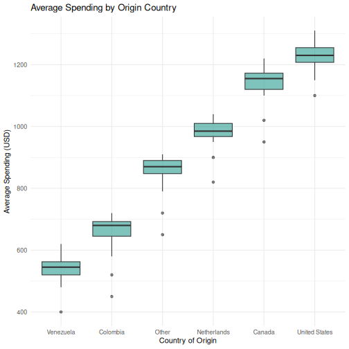
Let’s put everything together in a workflow that mirrors what you would do in SPSS, but entirely in code. Our research question: Does average spending differ between US and Netherlands visitors, and what else predicts spending?
R
# Step 1: Descriptive statistics by group
us_nl <- visitors |>
  filter(origin %in% c("United States", "Netherlands"))

us_nl |>
  group_by(origin) |>
  summarise(
    n = n(),
    mean_spending = mean(avg_spending_usd),
    sd_spending = sd(avg_spending_usd),
    mean_satisfaction = mean(satisfaction_score)
  )
OUTPUT
# A tibble: 2 × 5
  origin            n mean_spending sd_spending mean_satisfaction
  <chr>         <int>         <dbl>       <dbl>             <dbl>
1 Netherlands      20          978.        49.0              7.88
2 United States    20         1228.        48.2              8.00
R
# Step 2: Visualize the distribution
ggplot(us_nl, aes(x = origin, y = avg_spending_usd, fill = origin)) +
  geom_boxplot(alpha = 0.7) +
  labs(title = "Average Spending: US vs Netherlands",
       x = "Country of Origin",
       y = "Average Spending (USD)") +
  theme_minimal() +
  theme(legend.position = "none")
R
# Step 3: T-test --- is there a significant difference?
spending_t <- t.test(avg_spending_usd ~ origin, data = us_nl)
tidy(spending_t)
OUTPUT
# A tibble: 1 × 10
  estimate estimate1 estimate2 statistic  p.value parameter conf.low conf.high
     <dbl>     <dbl>     <dbl>     <dbl>    <dbl>     <dbl>    <dbl>     <dbl>
1     -249      978.     1228.     -16.2 1.21e-18      38.0    -280.     -218.
# ℹ 2 more variables: method <chr>, alternative <chr>
R
# Step 4: Regression --- what else predicts spending?
spending_model <- lm(avg_spending_usd ~ avg_stay_nights + origin + year,
                     data = visitors)
tidy(spending_model) |>
  mutate(across(where(is.numeric), ~ round(., 3)))
OUTPUT
# A tibble: 8 × 5
  term                estimate std.error statistic p.value
  <chr>                  <dbl>     <dbl>     <dbl>   <dbl>
1 (Intercept)         -7888.     2707.       -2.91   0.004
2 avg_stay_nights       131.        4.92     26.6    0
3 originColombia       -194.       12.6     -15.4    0
4 originNetherlands    -605.       17.9     -33.9    0
5 originOther           -94.8       9.65     -9.82   0
6 originUnited States   113.        6.38     17.8    0
7 originVenezuela      -284.       13.4     -21.1    0
8 year                    4.03      1.34      3      0.003
R
# Step 5: Model fit
glance(spending_model) |>
  select(r.squared, adj.r.squared, p.value, AIC)
OUTPUT
# A tibble: 1 × 4
  r.squared adj.r.squared   p.value   AIC
      <dbl>         <dbl>     <dbl> <dbl>
1     0.994         0.994 6.69e-122 1069.
This entire analysis — from descriptives to regression — is captured in a script that you can re-run at any time. If your data updates or a reviewer requests changes, you modify the code and run it again. No clicking through dialog boxes.
Challenge 1: Complete analysis workflow
Conduct a full analysis to answer this question: Do satisfaction scores differ between high-season (Q1 and Q4) and low-season (Q2 and Q3) quarters?
Your workflow should include:
- Create a new variable
seasonthat classifies Q1/Q4 as “High” and Q2/Q3 as “Low” - Compute descriptive statistics (mean and SD of
satisfaction_score) for each season - Create a boxplot comparing satisfaction scores by season
- Run an independent-samples t-test
- Use
broom::tidy()to extract the results into a clean table
R
# Step 1: Create the season variable
visitors_season <- visitors |>
  mutate(season = if_else(quarter %in% c("Q1", "Q4"), "High", "Low"))

# Step 2: Descriptive statistics
visitors_season |>
  group_by(season) |>
  summarise(
    n = n(),
    mean_satisfaction = mean(satisfaction_score),
    sd_satisfaction = sd(satisfaction_score)
  )
OUTPUT
# A tibble: 2 × 4
  season     n mean_satisfaction sd_satisfaction
  <chr>  <int>             <dbl>           <dbl>
1 High      60              7.71           0.382
2 Low       60              7.55           0.405
R
# Step 3: Boxplot
ggplot(visitors_season, aes(x = season, y = satisfaction_score,
                             fill = season)) +
  geom_boxplot(alpha = 0.7) +
  labs(
    title = "Satisfaction Scores: High vs. Low Season",
    x = "Season",
    y = "Satisfaction Score"
  ) +
  theme_minimal() +
  theme(legend.position = "none")
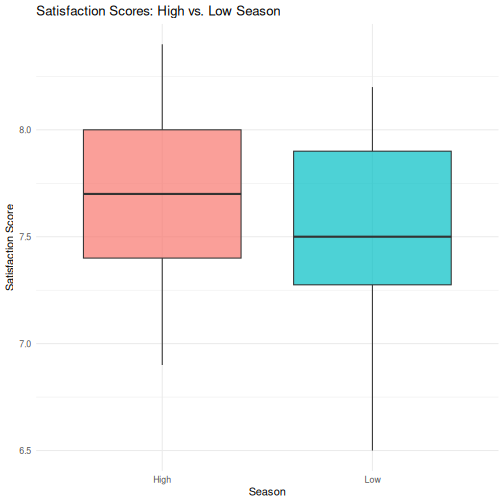
R
# Step 4: T-test
season_t <- t.test(satisfaction_score ~ season, data = visitors_season)
season_t
OUTPUT
	Welch Two Sample t-test

data:  satisfaction_score by season
t = 2.3194, df = 117.6, p-value = 0.0221
alternative hypothesis: true difference in means between group High and group Low is not equal to 0
95 percent confidence interval:
 0.02436478 0.30896855
sample estimates:
mean in group High  mean in group Low
          7.713333           7.546667
R
# Step 5: Tidy results
tidy(season_t)
OUTPUT
# A tibble: 1 × 10
  estimate estimate1 estimate2 statistic p.value parameter conf.low conf.high
     <dbl>     <dbl>     <dbl>     <dbl>   <dbl>     <dbl>    <dbl>     <dbl>
1    0.167      7.71      7.55      2.32  0.0221      118.   0.0244     0.309
# ℹ 2 more variables: method <chr>, alternative <chr>
Challenge 2: Correlation and regression
Investigate the relationship between avg_stay_nights and
avg_spending_usd:
- Run
cor.test()to get the Pearson correlation and p-value - Create a scatterplot with a linear trend line
(
geom_smooth(method = "lm")) - Fit a linear regression predicting
avg_spending_usdfromavg_stay_nights - Use
tidy()andglance()to extract the results - Interpret: for each additional night of stay, how much does spending increase?
R
# Step 1: Correlation
cor.test(visitors$avg_stay_nights, visitors$avg_spending_usd)
OUTPUT
	Pearson's product-moment correlation

data:  visitors$avg_stay_nights and visitors$avg_spending_usd
t = 8.0872, df = 118, p-value = 6.065e-13
alternative hypothesis: true correlation is not equal to 0
95 percent confidence interval:
 0.4680186 0.7013374
sample estimates:
      cor
0.5971648
R
# Step 2: Scatterplot
ggplot(visitors, aes(x = avg_stay_nights, y = avg_spending_usd)) +
  geom_point(aes(color = origin), alpha = 0.7, size = 2) +
  geom_smooth(method = "lm", color = "black", linewidth = 0.8) +
  labs(
    title = "Relationship Between Length of Stay and Spending",
    x = "Average Stay (Nights)",
    y = "Average Spending (USD)",
    color = "Origin"
  ) +
  theme_minimal()
OUTPUT
`geom_smooth()` using formula = 'y ~ x'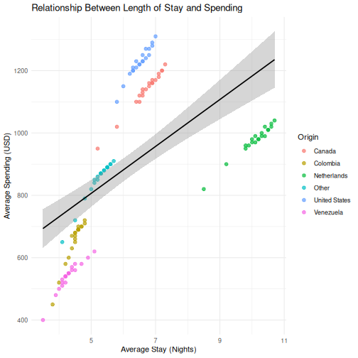
R
# Step 3: Regression
stay_model <- lm(avg_spending_usd ~ avg_stay_nights, data = visitors)

# Step 4: Extract results
tidy(stay_model)
OUTPUT
# A tibble: 2 × 5
  term            estimate std.error statistic  p.value
  <chr>              <dbl>     <dbl>     <dbl>    <dbl>
1 (Intercept)        430.      60.8       7.07 1.16e-10
2 avg_stay_nights     75.3      9.31      8.09 6.06e-13
R
glance(stay_model)
OUTPUT
# A tibble: 1 × 12
  r.squared adj.r.squared sigma statistic  p.value    df logLik   AIC   BIC
      <dbl>         <dbl> <dbl>     <dbl>    <dbl> <dbl>  <dbl> <dbl> <dbl>
1     0.357         0.351  204.      65.4 6.06e-13     1  -807. 1621. 1629.
# ℹ 3 more variables: deviance <dbl>, df.residual <int>, nobs <int>
R
# Step 5: Interpretation
# The coefficient for avg_stay_nights tells us:
# for each additional night of stay, average spending increases by
# approximately the "estimate" value in USD, holding all else constant.
- Every SPSS statistical test has a direct R equivalent, usually in a single function call
- R output is more compact than SPSS —
broom::tidy()converts it to a clean table - The workflow in R is: load data, run test, extract results, visualize — all in a script
- ANOVA and chi-square (and other methods) follow the same pattern — we point you to them in the follow-up material