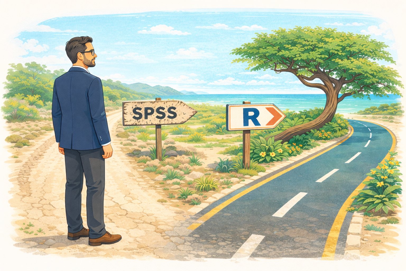
The Case for Switching
Last updated on 2026-05-05 | Edit this page
Estimated time: 45 minutes
Overview
Questions
- Why should I switch from SPSS to R?
- What can R do that SPSS cannot?
- How much does SPSS actually cost compared to R?
Objectives
- Describe the practical advantages of R over SPSS for research
- See live examples of R capabilities that go beyond SPSS
- Understand the cost and reproducibility arguments for switching
Introduction
This episode is a motivational opening. You will not write any code yourself yet — sit back and watch the instructor demonstrate what R can do. By the end, you should have a clear picture of why learning R is worth the investment of your time.
What you will be able to produce
By Friday afternoon you will be able to take a single R Markdown file and produce a polished, multi-page PDF report from it with one command. The worked example we will return to is a baseball statistics report on Xander Bogaerts, Aruba’s MLB star — the kind of document that would ordinarily take an afternoon of copy-paste between Excel, SPSS output, and Word, but that here is one file and one click. You will see the finished report in this opening so you know what you are aiming at. In Episode 6 you will build a smaller version of the same thing yourself.
What you will see
The instructor will demonstrate four things that are impossible or impractical in SPSS:
- Pulling a live research dataset — the DCDC Network’s small-island reference list, maintained on GitHub at the University of Aruba — straight into R, no browser required.
- Creating a publication-quality chart in under 10 lines of code.
- A reproducible report that updates automatically when new data arrives.
- An interactive dashboard built entirely in R.
If any of those sound appealing, you are in the right place.
The cost argument
Let us start with the most concrete reason. SPSS is expensive — especially for small island institutions that pay per seat.
| SPSS Standard | R + RStudio | |
|---|---|---|
| License type | Annual subscription | Free, open-source |
| Cost per user per year | USD 1,170 – 5,730 (varies by tier) | USD 0 |
| 5-year cost for 5 users | USD 29,250 – 143,250 | USD 0 |
| Runs on | Windows, Mac | Windows, Mac, Linux, cloud |
| Updates | Paid upgrades | Continuous, free |
For a university department in the Dutch Caribbean with three SPSS licenses, that is easily AWG 10,000+ per year that could be redirected to research funding, student assistants, or conference travel.
“But my institution already pays for SPSS”
That is true today. But institutional budgets change, and when you graduate or change jobs, your personal SPSS license disappears. R stays with you forever — on your laptop, on a cloud server, on a Raspberry Pi if you want. Your scripts will still run in 10 years.
What R gives you that SPSS does not
Reproducibility
In SPSS, a typical workflow looks like this: open a dataset, click through menus, copy output into Word, repeat. If your supervisor asks “can you re-run this with the updated data?”, you have to remember every click.
In R, your entire analysis lives in a script. You change one line (the file path) and re-run. Every step is documented.
Packages
SPSS has a fixed set of procedures. R has over 20,000 add-on packages on CRAN alone, covering everything from Bayesian statistics to text mining to geographic mapping. If a method exists, there is probably an R package for it.
Automation
Need to run the same analysis on 50 files? In SPSS, that means 50 times through the menus (or learning SPSS syntax, which few people do). In R, it is a three-line loop.
Live demonstration
The instructor will now run a live demonstration. Watch the screen.
What is happening on screen
Do not worry about understanding the code right now. The goal is to see what is possible. You will learn the building blocks starting in the next episode.
This is the complete script to run live. Practice this before
the workshop. Make sure tidyverse is installed —
everything we need for the demo comes with it.
Step 1: Frame the source before you type
Before the first keystroke, name what the room is about to see. The
CSV about to load is in a GitHub repository maintained at the University
of Aruba — island-research-reference-data — part of the
DCDC Network’s shared infrastructure for island research. It is not a
third-party service you hope stays up. It is research data the network
owns and curates. That framing matters: the “wow” is not just that R can
read a URL. It is that the data layer underneath belongs to us.
Step 2: Pull the SIDS reference list
Open a new R script in RStudio and type (or paste) the following. Run it line by line so participants can watch each step.
R
# Load packages (install tidyverse once, before the workshop)
# install.packages("tidyverse")
library(tidyverse)

# Pull the UA island-research reference list straight from GitHub
countries <- read_csv(
  "https://raw.githubusercontent.com/University-of-Aruba/island-research-reference-data/main/countries/countries_reference_xlsform.csv"
)

# Quick look at what we got
head(countries)
Pause. Point out: “No browser. No download dialog. No save-as. The file is now a live object in my session, with over a dozen columns per country.”
Step 3: Filter to SIDS and chart by region
R
countries |>
  filter(is_sids == 1) |>
  count(wb_region) |>
  ggplot(aes(x = reorder(wb_region, n), y = n)) +
  geom_col(fill = "#44759e") +
  coord_flip() +
  labs(
    title = "Small island developing states by World Bank region",
    x = NULL,
    y = "Number of SIDS"
  ) +
  theme_minimal(base_size = 14)
Pause again. Key talking points:
- “This chart is ready for a report as-is. Title, axis labels, colour, proportions — all set in code.”
- “If the UA team adds a country to the reference list tomorrow, I re-run this script and the chart updates. No re-click, no re-export.”
- “Every editorial choice — what counts as a SIDS, which region goes where — is traceable, because the definitions sit in the source CSV you just pulled.”
Step 4: Show the contrast with SPSS
Ask the audience: “How would you have done this in SPSS?”
Walk through it slowly. Make it sting a little — this is the moment the cost of the current workflow lands.
- Go looking for a canonical SIDS list. UN-OHRLLS? UN DESA? A supplementary table from a recent paper? Pick one and hope it is current.
- If you cannot find a clean download, email a colleague who might have one saved somewhere. Wait for a reply. Half a day, on a good day.
- Open the CSV you eventually receive. Discover that “Cabo Verde” and “Cape Verde” are different strings, that some country codes are ISO-2 and others ISO-3, that one row has a stray trailing comma. Clean by hand.
- Import the cleaned file into SPSS. Recode the region variable because whatever classification the file uses does not match World Bank regions.
- Analyze > Descriptive Statistics > Frequencies on region. Copy the output table.
- Graphs > Chart Builder, drag variables, format the chart, copy, paste into Word.
Then say: “That is half a morning, on a good day, assuming the colleague replies and the file is clean. In R it was six lines and ten seconds — from a dataset the DCDC Network maintains, so the next person who needs it gets the same clean answer.”
Summary
You have now seen R:
- Pull live data from the internet with a single function call
- Create a publication-ready chart in 10 lines of code
- Do both of these things in a way that is fully reproducible
Starting in the next episode, you will learn to do these things yourself — one step at a time.
- R is free, open-source, and runs on any operating system
- R scripts make your analysis fully reproducible
- R can pull data from APIs, create interactive visualizations, and automate reports — things SPSS cannot do
- Switching builds on your existing statistical knowledge, not replaces it