
Where to Go from Here
Last updated on 2026-09-29 | Edit this page
Overview
Questions
- Where do I find help when I get stuck?
- What resources are available for continued learning?
- How do I access Dutch Caribbean data directly from R?
Objectives
- Know where to find help: documentation, community forums, Stack Overflow
- Access Dutch Caribbean data using R packages (cbsodataR, WDI)
- Build a personal library of R scripts that replace SPSS workflows
- Understand the Carpentries community and further learning paths
Getting help
Everyone gets stuck. Experienced R users see as many errors as beginners do. What they have is a habit of knowing where to look. Here are the most useful help resources, in order of how quickly they give you an answer.
Built-in documentation
Every R function has a help page. Access it in two ways:
R
# These two are equivalent:
?mean
help("mean")
The help page shows what arguments the function takes, what it returns, and usually includes examples at the bottom. The examples are often the most useful part, so scroll down to them first.
Tip: run the examples
At the bottom of most help pages there is an Examples section. You can run all of them at once with:
R
example(mean)
This is a fast way to see what a function does without reading the full documentation.
Posit cheat sheets
Posit, the company behind RStudio, publishes two-page cheat sheets for the most popular packages. Print these out or keep them open on a second screen:
-
Data import:
readr,readxl -
Data transformation:
dplyr -
Visualization:
ggplot2 - R Markdown
Find them all at https://posit.co/resources/cheatsheets/
R Graph Gallery
R Graph Gallery (https://r-graph-gallery.com) is a searchable catalogue of ggplot2 examples with the full code for each one. When you know roughly what kind of chart you want but not the syntax to build it, this is where to start.
Stack Overflow
Stack Overflow has a large collection of R questions and answers.
When searching, add [r] to your search to filter for
R-specific content:
site:stackoverflow.com [r] how to rename columns dplyrBefore posting your own question, search first. Most beginner questions have already been answered. When you do post, include a minimal reproducible example, a small piece of code that someone else can run to see your problem.
Posit Community
The Posit Community forum (https://community.rstudio.com) is a friendlier, more focused alternative to Stack Overflow. It is specifically for R and RStudio questions, and the community is welcoming to beginners.
R-bloggers
R-bloggers aggregates hundreds of R blogs. It is a good place to discover tutorials, new packages, and practical examples. You can subscribe to the email newsletter for a daily digest.
Dutch Caribbean data in R
One practical advantage of R over SPSS is that you can pull data
directly from online sources into your session, with no manual downloads
and no saving .sav files. Here are the sources most
relevant to work in the Dutch Caribbean.
CBS Netherlands with cbsodataR
The cbsodataR package connects directly to CBS
(Statistics Netherlands) StatLine, which includes data for the BES
islands, Bonaire, Sint Eustatius, and Saba, and sometimes Aruba,
Curaçao, and Sint Maarten.
R
# Install the package (only needed once):
install.packages("cbsodataR")
R
library(cbsodataR)

# Browse available tables (there are thousands):
tables <- cbs_get_datasets()

# Search for Caribbean tables:
caribbean_tables <- tables |>
  dplyr::filter(grepl("Caribisch|Caribbean|Curacao|Bonaire", Title,
                      ignore.case = TRUE))

# View what we found:
head(caribbean_tables[, c("Identifier", "Title")], 10)
Once you find a table of interest, download it directly:
R
# Check cbs_get_datasets() for current table identifiers
pop_data <- cbs_get_data("83698ENG")

head(pop_data)
Finding the right table
CBS has thousands of tables, and the identifiers like “83698ENG” change over time. The safest approach is to:
- Search on opendata.cbs.nl in your browser
- Find the table you want
- Copy the identifier from the URL
- Use that identifier in
cbs_get_data()
World Bank data with WDI
The WDI package pulls data from the World Bank’s World
Development Indicators. This is useful for comparing Curaçao to Aruba,
Sint Maarten, and other small island states.
R
# Install the package (only needed once):
install.packages("WDI")
A working example that pulls GDP per capita for Curaçao:
R
library(WDI)

# Country code for Curaçao is "CW" in the World Bank's two-letter scheme
curacao_gdp <- WDI(
  country = "CW",
  indicator = "NY.GDP.PCAP.CD",
  start = 2000,
  end = 2023
)

# Clean up column names
names(curacao_gdp)[names(curacao_gdp) == "NY.GDP.PCAP.CD"] <- "gdp_per_capita"

# Show the most recent years
tail(curacao_gdp[, c("year", "gdp_per_capita")], 10)
OUTPUT
   year gdp_per_capita
15 2009       19540.25
16 2008       19423.34
17 2007       18005.72
18 2006       17400.16
19 2005       17032.34
20 2004       16671.34
21 2003       16695.74
22 2002       16723.69
23 2001       16609.85
24 2000       15841.26
You can compare several countries at once:
R
library(WDI)
library(ggplot2)

# Compare Curaçao (CW), Aruba (AW), and Sint Maarten (SX)
island_gdp <- WDI(
  country = c("CW", "AW", "SX"),
  indicator = "NY.GDP.PCAP.CD",
  start = 2000,
  end = 2023
)

names(island_gdp)[names(island_gdp) == "NY.GDP.PCAP.CD"] <- "gdp_per_capita"

ggplot(island_gdp, aes(x = year, y = gdp_per_capita, colour = country)) +
  geom_line(linewidth = 1) +
  labs(
    title = "GDP per capita, Dutch Caribbean comparison",
    x = "Year",
    y = "GDP per capita (current USD)",
    colour = "Country"
  ) +
  theme_minimal()
Country codes are a recurring trap
The World Bank uses two-letter codes in WDI()
(CW, AW, SX), the FIFA dataset
you used in Episode 5 uses three-letter ISO codes (CUW,
ABW, SXM), and CBS uses its own scheme. Half
the joins that fail in real projects fail here.
The islandcodes package, developed at the University of
Aruba and available on CRAN, exists specifically to translate between
them for small island states and territories:
R
install.packages("islandcodes")
library(islandcodes)
How to find World Bank indicator codes
The easiest way to find indicator codes is
WDIsearch():
R
# Search for indicators related to tourism:
WDIsearch("tourism")

# Search for indicators related to GDP:
WDIsearch("GDP per capita")
You can also browse indicators at https://data.worldbank.org/indicator.
Direct downloads from CBS Curaçao
CBS Curaçao (https://www.cbs.cw) publishes data in Excel and PDF format. There is no dedicated R package, but you can download and read Excel files directly:
R
library(readxl)

# Download an Excel file to a temporary location:
url <- "https://www.cbs.cw/some-published-table.xlsx"
temp_file <- tempfile(fileext = ".xlsx")
download.file(url, temp_file, mode = "wb")

# Read it into R:
curacao_data <- read_excel(temp_file)
The same approach works for CBS Aruba (https://cbs.aw).
Open datasets from the University of Aruba
The University of Aruba maintains public reference datasets relevant to research on the Dutch Caribbean and small island states. Both are CSV files hosted on GitHub, so you can pull them into R without installing anything.
Dutch Caribbean election results at github.com/University-of-Aruba/CAS_election_data.
A tidy dataset of votes by party for elections across Aruba (1985-2024),
Curaçao (2010-2025), and Sint Maarten (2010-2024). One row per party per
election, with columns for year, country,
party, and votes.
R
# Read the CSV directly from GitHub
elections <- read.csv(
  "https://raw.githubusercontent.com/University-of-Aruba/CAS_election_data/main/dutch_caribbean_elections.csv"
)

# How fragmented has each Curaçao election been?
library(dplyr)
elections |>
  filter(country == "Curacao") |>
  group_by(year) |>
  summarise(
    parties = n(),
    total_votes = sum(votes),
    largest_share = round(100 * max(votes) / sum(votes), 1)
  ) |>
  arrange(year)
Small island reference list at github.com/University-of-Aruba/island-research-reference-data. A country and territory list with classifications for SIDS, SNIJ, World Bank region, and income group. Designed for XLSForm survey tools such as KoboToolbox and ODK, and equally useful as a lookup table to filter or join any other dataset by country code.
R
library(dplyr)

countries <- read.csv(
  "https://raw.githubusercontent.com/University-of-Aruba/island-research-reference-data/main/countries/countries_reference_xlsform.csv"
)

sids <- countries |>
  filter(is_sids == 1) |>
  select(iso_code, label, wb_region, wb_income_group)

head(sids)
A taste of text analysis
The tools you already know, dplyr for filtering and
counting and ggplot2 for charts, are enough to start
analysing text. You do not need a special package to count words.
Here is a short sample of institutional Papiamentu. We will find its most frequent meaningful words.
R
library(dplyr)
library(ggplot2)

text <- "Pais Kòrsou ta un isla den Karibe ku hopi hende kordial i un kultura
riku. E pueblo di Kòrsou ta biba di turismo, komersio i servisio públiko.
Gobièrnu di Kòrsou ta traha pa krea oportunidat pa tur siudadano. Nos idioma
Papiamentu ta e idioma prinsipal ku ta uni nos komo pueblo. E Dutch Caribbean
Data Community (DCDC) ta un red pa analista i trahadó di datos di henter e
region, ku enfoke riba kalidat, transparensia i kooperashon."

# Split the text into words, lowercase everything, strip punctuation
words <- text |>
  tolower() |>
  strsplit("[[:space:][:punct:]]+") |>
  unlist()

# Hand-curated Papiamentu stopwords: the short function words that carry
# little meaning on their own
stopwords_pap <- c("e", "un", "nos", "su", "tur", "di", "pa", "na", "ku",
  "riba", "den", "i", "o", "of", "si", "no", "ta", "lo", "por",
  "mester", "tin", "a", "aki", "ei", "kua", "mas", "komo", "")

# Count words, remove stopwords, keep the top 10
word_counts <- tibble(word = words) |>
  filter(!word %in% stopwords_pap) |>
  count(word, sort = TRUE) |>
  slice_head(n = 10)

ggplot(word_counts, aes(x = n, y = reorder(word, n))) +
  geom_col(fill = "#2e8894") +
  labs(
    title = "Most frequent meaningful words",
    x = "Count",
    y = NULL
  ) +
  theme_minimal()
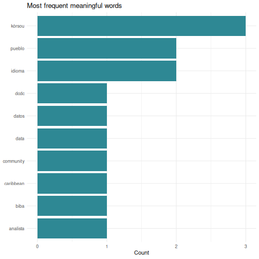
The same pattern works on any text: a column of survey comments, a PDF you have read into R, a folder full of reports. The steps are always split into words, lowercase, drop stopwords, count, chart.
Your stopword list is an analytical choice
That stopwords_pap vector was written by hand, and it is
written in Curaçao orthography. Run the same code over an Aruban text,
where the same words are spelled cu, y,
ey, cual, como, and half of it
stops working. Words you meant to drop survive, and your top-ten list
fills with function words.
There is no neutral stopword list. Someone chooses what counts as meaningless, and for a language with two written standards that choice is not only technical. Whatever you build, publish the list alongside the result so a reader can see what you removed.
Actual wordclouds
Bar charts communicate better than wordclouds for most analysis.
Wordclouds are fun to share, and sometimes right for a presentation
slide. The ggwordcloud package plugs straight into the
ggplot2 workflow:
R
install.packages("ggwordcloud")
library(ggwordcloud)

ggplot(word_counts, aes(label = word, size = n)) +
  geom_text_wordcloud() +
  scale_size_area(max_size = 20) +
  theme_minimal()
Install it when you have time after the course. Nothing else depends on it.
Building a personal script library
Over time you will write scripts that solve specific problems: cleaning a particular dataset, running a standard analysis, producing a recurring report. Do not let these disappear. Build a personal library.
Practical tips
Save every analysis as a
.Ror.Rmdfile. Never rely on your console history alone.-
Use clear file names that describe what the script does:
01_clean_squad_data.R
02_quarterly_summary_report.Rmd
03_composition_by_island_analysis.R
Comment generously. You will forget why you wrote something in three months. Write comments that explain the why, not just the what:
R
# Exclude players coded X: club could not be established from any source,
# so counting them as island-based would understate the diaspora share
squad_clean <- squad |>
  filter(club_country != "X")
-
Create a project folder structure:
my-project/
├── data/          # Raw data files (never edit these)
├── scripts/       # R scripts for data cleaning and analysis
├── output/        # Generated reports and figures
└── README.txt     # What this project is about
Use RStudio Projects (File > New Project) to keep everything together. Projects set your working directory automatically and keep your files organised.
Your scripts are your institutional memory
In many small-island government offices, knowledge walks out the door when staff transfer or retire. If your analyses live in commented scripts, the next person can pick up where you left off, even if they only know basic R.
This is worth being deliberate about rather than hoping for. A script that only you can run is a dependency on you. A script with a README, a data folder, and comments explaining the judgement calls is capability that stays in the office.
Letting AI write the R
Most of you will generate more R than you type, and for routine work a model is faster than any of us. A course taught in 2026 that pretended otherwise would be wasting your morning.
What changes is the job. You stop being the person who writes the code and become the person who decides whether it is right, and that decision runs on exactly what these two days gave you. Generated R fails in ways that read beautifully:
- It calls functions and arguments that do not exist, in the confident tone of code that does.
- It drops rows quietly. A missing value handled the wrong way changes an average without changing the output’s appearance.
- It hands you an interpretation along with the result. Episode 5 is the warning here: asked to describe a null, a model will often narrate a finding.
- It writes against a package version you do not have, or an idiom that was replaced three years ago.
Working with it well looks like working with a fast junior colleague.
Show it the shape of your data with str() or
head() rather than describing it, ask for one step at a
time, run every step, and check the row count before and after anything
that filters or joins. Keep the script, because the script is what makes
the result reproducible, and a chat window is not.
One rule that is not about quality. Anything you paste into a public model leaves your institution, and supervisory data, personal data and unpublished figures should never go near one. Check what your organisation permits before you paste, and prefer sharing the structure of your data over the data itself.
Continued learning
Free books and courses
R for Data Science (2nd edition) by Hadley Wickham, Mine Cetinkaya-Rundel, and Garrett Grolemund. Free online at https://r4ds.hadley.nz. This is the single best next step. It covers everything in this course in more depth, plus much more.
The Carpentries offers free, community-taught workshops on R, Python, Git, and more. Lessons are at https://carpentries.org/community-lessons/.
Posit Cloud (https://posit.cloud) gives you RStudio in your browser with free interactive primers. Good for practising without installing anything.
Community
DCDC Network, the Dutch Caribbean Digital Competence Network, is your regional peer network. If you are taking this course you are already part of it. Use it to share scripts, ask questions, and collaborate across the islands.
Posit Community (https://community.rstudio.com), ask questions, share your work, help others. The best way to learn is to teach.
TidyTuesday, a weekly community data visualization challenge. Every Tuesday a new dataset is posted and people share their analyses: https://github.com/rfordatascience/tidytuesday
Between-session practice assignment
The between-session practice assignment is a separate page so it can be handed to you at the end of Day 1 and opened from any device overnight. See the Homework brief under the “For Learners” menu of this site.
Challenge 1: Pull World Bank data and visualize it
Use the WDI package to pull a World Bank indicator for
Curaçao and create a plot:
- Load the
WDIandggplot2packages - Use
WDIsearch()to find an indicator that interests you, for example international tourism arrivals, unemployment, or population - Use
WDI()to download the data for Curaçao, country code"CW" - Create a line plot showing how the indicator changes over time
- Add a meaningful title and axis labels
An example using international tourism arrivals:
R
library(WDI)
library(ggplot2)

# Search for tourism-related indicators:
WDIsearch("international tourism, number of arrivals")

# ST.INT.ARVL = International tourism, number of arrivals
curacao_tourism <- WDI(
  country = "CW",
  indicator = "ST.INT.ARVL",
  start = 2000,
  end = 2023
)

names(curacao_tourism)[names(curacao_tourism) == "ST.INT.ARVL"] <- "arrivals"

# Remove rows where arrivals is missing
curacao_tourism <- curacao_tourism[!is.na(curacao_tourism$arrivals), ]

ggplot(curacao_tourism, aes(x = year, y = arrivals)) +
  geom_line(linewidth = 1, colour = "#2e8894") +
  geom_point(size = 2, colour = "#2e8894") +
  scale_y_continuous(labels = scales::comma) +
  labs(
    title = "International tourism arrivals to Curaçao",
    subtitle = "Source: World Bank World Development Indicators",
    x = "Year",
    y = "Number of arrivals"
  ) +
  theme_minimal()
Your indicator and chart will look different depending on which indicator you chose, and that is fine. The skills are searching for an indicator, downloading the data, and visualizing it.
If your series comes back short or full of gaps, that is not a mistake on your part. Coverage for small island territories in international databases is patchy, and noticing it is part of the work.
You are ready
You now know how to import data, transform it, visualize it, test hypotheses, and produce automated reports, all in R. That is a solid foundation. The most important thing now is to use it. The next time you need to analyse data, try doing it in R instead of SPSS. You will be slower at first, and each time it gets easier. Everything you produce is reproducible and open to challenge, which is a better position to argue from.
Taking your homework further
The four-hour format has no open lab slot, so this section is yours to work through after the course, on the homework brief script you built between the two sessions. If the room is ahead of schedule the instructor may take one or two of these live instead.
Open your homework script and look at three things: what you built, any errors you kept in a comment at the top, and one thing you would still like the script to do. Then pick a target below.
Good extension targets, from lightest to heaviest:
-
Refine the chart. Try a second
geom_*, a different colour mapping, or a facet. Re-run and see which version communicates best. -
Add a second summary. Re-run
group_by()andsummarise()on a different grouping variable and compare. - Text in your data. If your dataset has a free-text column, survey comments, category labels, document titles, apply the split, stopword, count, chart pattern from the text-analysis section above.
-
Move into R Markdown. Lift your
.Rfile into a new.Rmd, add a title and two sentences of prose, and knit it. You now have a one-page report.
Bring questions to the instructor and to the person next to you. The goal is that you leave with a script you can run again next week on fresh data.
Before you leave
Please take a few minutes to complete these short surveys. Your feedback helps us improve the course and strengthens the DCDC Network.
Course evaluation, tell us what worked and what you would change. It shapes the next session.
Complete the course evaluation survey
DCDC Network onboarding, help us understand your data practices and connect you to the broader network. This feeds into DCDC research on digital competence across the Dutch Caribbean.
Complete the DCDC Network onboarding survey
- R has a large, active community, so you are never stuck alone
-
cbsodataRandWDIpull Dutch Caribbean data directly into R - Country coding schemes differ between sources, and that is where most joins break
- A stopword list is an analytical choice; publish it with your results
- Save your analyses as scripts and build a personal reference library
- The DCDC Network is your regional peer community for continued learning